»
S
I
D
E
B
A
R
«
Analyzing Changes in Shot Types Over the Course of a Game
August 9th, 2009 by Jon Nichols

Recently I explored how shot types change during the final two minutes of a game.  However, that only gave snapshots based on certain timeframes that I chose.  Looking at how those shot types change, second by second, is much more enlightening.  That is what I will be doing today.  For each shot type, I will calculate the total amount of attempts from every game this year for each second.

Let’s start with three-pointers.  From the last study, we saw that three-point attempts increase dramatically relative to other shot attempts in the last two minutes.  Is that a late-game surge only or do three-point attempts increase progressively throughout the game?  Here’s the data:
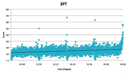
Three-Pointers

Outliers (which occurred at the end of each quarter) were removed from the graph for the sake of clarity.  As you can see, there’s a significant increase in attempts as the game goes on.  We also see a very rapid increase at the end of the game.  I won’t speculate as to why this happens, but it certainly is interesting.

In the last two minutes, three-point attempts increase mostly at the expense of midrange/post attempts.  Is this only a late-game trend, or does it gradually occur during all 48 minutes?  Let’s look at midrange attempts:
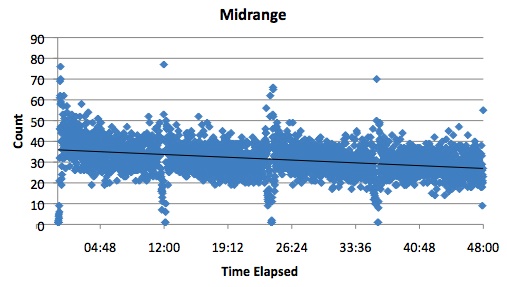
Midrange

Two-point shots away from the basket appear to do the opposite of three-pointers.  They start at their highest frequency and gradually decrease as the game goes on.  In the final moments the decline slows, but that is because all shot attempts, regardless of shot type, increase in the final seconds.

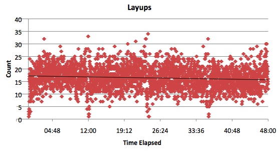
Layups are the third shot type with a large enough sample size at each second in the game to make some sense of it:
Layups

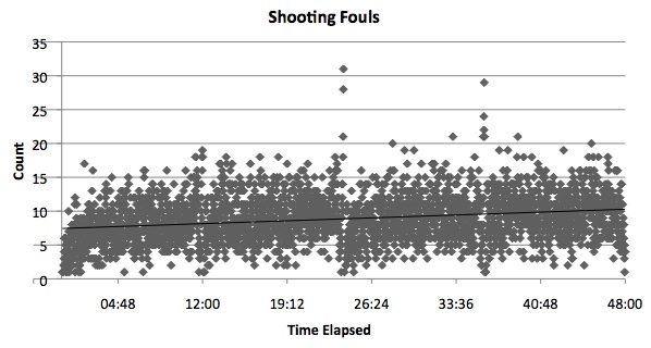
Layups decline ever so slightly as the game progresses.  At the start of the game the trendline is at around 17, and by the end it is just above 15.  This difference is very small and can possibly be explained by one other change as the game progresses: fouls.  How do shooting fouls change over the course of a game?
Shooting Fouls

These fouls rise by about 2.5 during the 48 minutes, so it may be that layups just go down because shooting fouls (which will not show the shot type in the play-by-play) go up.  We don’t know that most shooting fouls are on layup attempts, but outside shooters are rarely fouled and dunks, tips, and putbacks are infrequent enough to not be much of a factor.

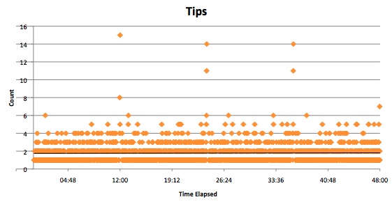
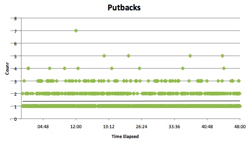
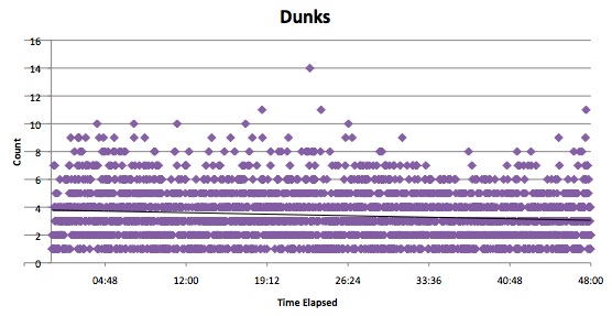
What about those dunks, tips, and putbacks?  I’ve put together graphs on all three shot types, but good luck making any sense of them:
Dunks

Tips

Putbacks

In conclusion, teams don’t move away from midrange/post and towards three-point shots only in the last two minutes.  This appears to be a phenomenon that occurs from the very start of the game. Also, layups go down as the game progresses, but this may just be because of an increase in shooting fouls.

Although this information is interesting at the league-wide level, it may be even more helpful on a team-by-team basis.  If you knew how a certain team changes its style as the game progresses, it would be easier to game plan for them.  This is something I will look into studying in the future.


5 Responses  
Dave writes:
August 10th, 2009 at 1:31 am

Jon - can we call Layups, Dunks, Tips, Putbacks all finishes at the rim - as opposed to a ranged (6ft jumper / hook = Midrange?) 2pt shot, as opposed to 3s.

I wonder too if you aren’t getting some of the variability due to such short intervals (and why you are getting wild fluctuations at end of quarters where time is often measured in 10ths of sec). Maybe taking 6s chunks would smooth some of the noise? but not be too coarse to obscure trends. if you split it into 15s chunks that works out at approx 200 intervals which we could approximate to posessions.

One things I am suprised by is that you do not have any 0’s - did you not chart zero values? eg. at start of game, I am suprised there is any shot attempt inside 3s.

You seem to be getting some interesting behaviour occuring at end / start of quarters, if you exclude those periods, do the game long trends still emerge?
Also I note that the ’spike’ for shooting fouls occurs at end of Q1,Q2and Q3, but NOT at end of Q4 - corresponding very nicely with the ’spikes’ in the Mid-range and Layups.

Jon Nichols writes:
August 10th, 2009 at 1:49 am

Finishes at the rim would probably do the trick. I made those five categories at the beginning and haven’t changed them since, but I might as well.

It shouldn’t matter that time is measured by tenths of seconds at the end of quarters. The play-by-play data doesn’t record that specific of time. I could split it into six second chunks, but I personally don’t think the fluctuations are too strong.

No, I did not chart 0 values.

I already did exclude the end of quarter data and the beginning of quarter data is probably automatically excluded since it would be mostly zero values.

Wouldn’t everything spike at the end of each quarter because teams are racing to beat the clock and will force an outcome (regardless of shot type)?

Dave writes:
August 11th, 2009 at 1:30 pm

Hmm, for any given second the number of attempts might be within 10 of the next second, I would call that very noisy given the magnitude of your data and want to present it in a smoother form.

If you used a moving average ( somewhere between 6 and 15s should work best) then you should still be able to caputre the change in frequency for a shot type.

I am most interested in eFG%. Just because teams are managing to attempt more 3s as the game goes on, does it result in an improved rate of scoring? This is would be a significant piece of information on the best shot distribution argument.

What do you think of the apparent decline in Shooting fouls at end of 4th quarter, is that the leading team trying not to foul, or the influence of the fact that as games run down, more and more games move into the ‘decided’ category and so teams are playing out clock?

I agree about a team by team analysis, but you are not going to have enough data to analyse that on a per second basis.

Jon Nichols writes:
August 11th, 2009 at 5:37 pm

Dave, a smoother looking graph would always be preferable. I usually just prefer presenting the data in the rawest form possible, though.

As for the “best shot distribution argument,” I’m definitely not trying to do that. I’m not trying to suggest that three-pointers are better or worse as the game goes on. I’m merely trying to show that teams attempt more of them as the game goes on relative to other shot types.

The shooting fouls dip at the end may very well just be because of the fact that I didn’t limit the data to just close games. Blowouts are included as well, so like you said, certain games will feature practically no fouls at the end.

I do plan on doing a team by team analysis next, and yes, there isn’t enough data on a per second basis. Right now I’m leaning towards showing the data in one minute increments.

Hardwood Paroxysm » Blog Archive » Nichols and Dime: Exploring Shot Types at the Team Level: Los Angeles Lakers writes:
August 13th, 2009 at 2:29 am

[...] my last article, I suggested that knowing how an individual team changes the way it attempts its shots as a game [...]

Leave a Reply

»  Substance: WordPress   »  Style: Ahren Ahimsa
© Copyright 2009 Basketball-Statistics.com